 Copyright © Michael Richmond.
This work is licensed under a Creative Commons License.
Rather than take a final exam, students in this class must submit as a final project a poster which describes some aspect of extragalactic astronomy or cosmology. Students may work by themselves, or in groups of two. You must submit a copy of your poster to myCourses, in the "Assignments" tab, by the deadline of Wed, May 3, at 5:00 PM EDT.
Below are some guidelines to keep in mind as you create your poster.
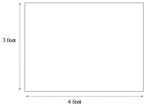
A standard poster is 4 feet wide by 3 feet high; in this class, you must make your poster have a width of

Your goal is to convey to your audience the basic idea behind your topic:
Who is going to be reading your poster? The primary audience will be other students in this class, of course. However, your poster may go up on the walls of Gosnell, in which case random students and faculty walking through the College of Science may see your poster. Most of them will know little about astronomy, telescopes, galaxies, or other celestial entities. You will have to
This can be a delicate balancing act. On the one hand, your poster needs some pizzazz in order to make a passing student take a second look at it. On the other hand, all style and no substance will leave the viewer with an empty feeling, like a dinner of Twinkies. There needs to be a reasonable amount of science mixed in with the eye-candy.
Consider ways to make your work more visibly appealing:
           Good                      Better
   -------------------          ------------------------------
      graphs                      graphs with color highlights

      images                      big images
                                  images with bold captions
                                  images with labelled features

      title                       big, bold title

      text                        text in moderate chunks
                                  text with bold headings

      telling what worked         telling what worked and what DIDN'T work
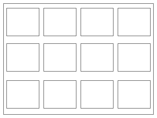
Lots of posters these days are simply Powerpoint presentations plastered in a big piece of paper:

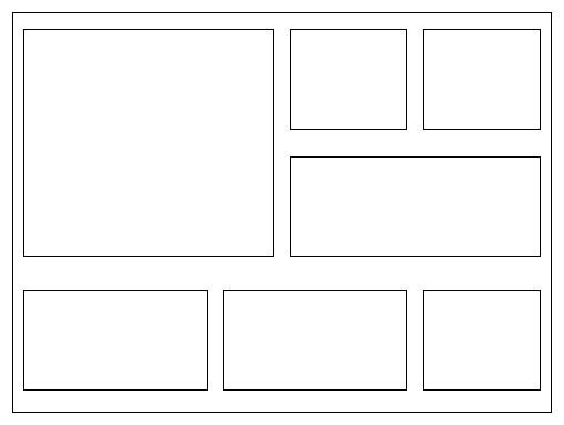
I don't like this format: no single unit is large enough to capture the eye. It's okay to place your work on a grid, but break it up with some large and some small pieces:

You may use any tool you wish to design and build your poster, but when you've finished, make sure to export it in PDF format. That's the version we'll send to the printer.
Would you like to improve your first draft, so that the final version you submit will knock my socks off? Try the following:
There are many web sites which provide good advice in making an effective poster. The list below is not exhaustive by any means.
 Copyright © Michael Richmond.
This work is licensed under a Creative Commons License.