 Copyright © Michael Richmond.
This work is licensed under a Creative Commons License.
Copyright © Michael Richmond.
This work is licensed under a Creative Commons License.
Scientists have a tough job: the world is a complicated place, and it is filled with innumerable objects in a nearly infinite variety. How can we make sense of it all?
One common approach is
If we're lucky, we might find some mathematical connection between different properties; that, in turn, might give us some idea for what is going on.
Let me show two examples of this approach.
I'm an astronomer, so I like to study stars. There are a LOT of stars in our Milky Way Galaxy.
Image of M39 and surroundings courtesy of
md11spotter98
Some are bright, some are faint. Some are orange, some blue, and lots appear to be whitish. In some places, they are packed close together; in others, dark gaps appear to separate them. How can we make sense of all this information?
Well, we could measure a bunch of properties,
and then try plotting one variable against another. If we're lucky, we might see some pattern. Fortunately for us, the Gaia space telescope has recently released a large set of very accurate measurements for stars all over the sky.
Let's try plotting "Distance" on the vertical axis, and "Temperature" on the horizontal axis. Do you see any pattern?
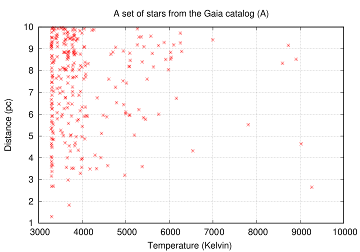
Hmm, not really. It appears that hot stars are relatively uncommon, but that's about all we can conclude.
Suppose we try plotting the North-South position of a star in the sky -- like latitude, but in space -- against, oh, the color of the star.
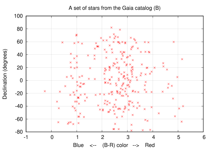
Nope, that's basically a random scatter of points. Rats.
But if we pick the luminosity (radiated power) of each star and the color, well, see for yourself:
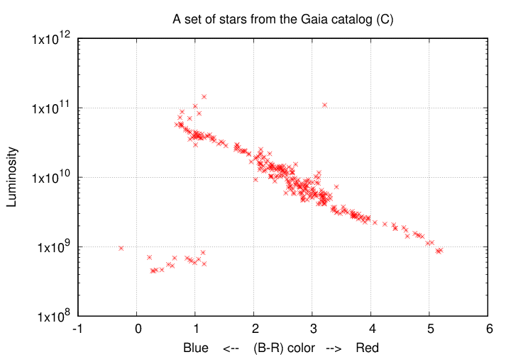
This choice yields what astronomers call a Hertzsprung-Russell diagram, or sometimes a color-magnitude diagram. It turns out that we can learn a LOT about stars and their evolution from this sort of diagram.
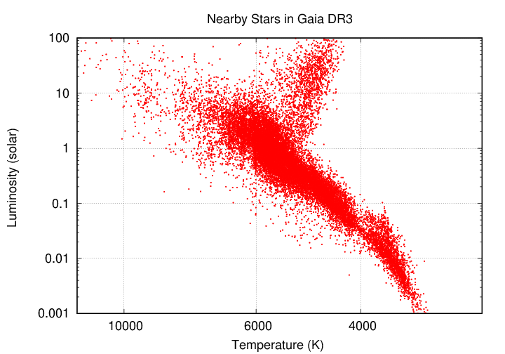
For example, let's compare the luminosity of each star to its temperature. I'll grab a larger sample of stars from the recent Gaia space mission. If we plot the results on a log-log scale, we see the same sort of relationship as when we used color.
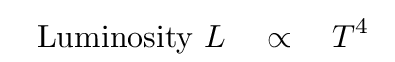
Now, when solid or dense gaseous objects emit radiation because they are hot, there's a simple equation connecting temperature to luminosity: the blackbody equation
If all stars were the SAME SIZE, then their luminosity should increase with temperature to the fourth power. But that connection doesn't seem to match the observations very well.
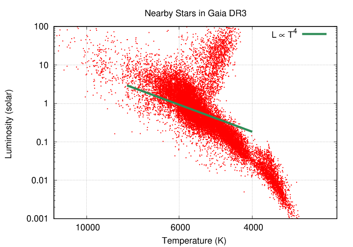
On the other hand, if hot stars are also LARGER than cool stars, then their luminosity should increase as a higher power of temperature. And -- that does seem to match the observations.
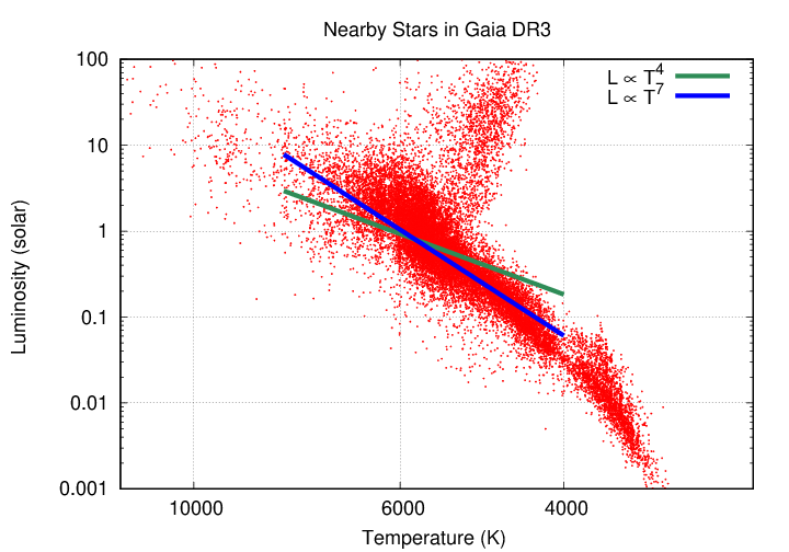
So, just by looking for mathematical relationships between quantities we can measure, astronomers can learn something fundamental about stars:
In general(*), hot stars are larger than cool ones.
That's a pretty powerful method of analysis.
Mammals come in a wide range of varieties:

Image courtesy of
Wikipedia
Some are big, some are small, some can fly, some can swim, a few can even use tools. Biologists can spend an entire lifetime learning about the behavior and anatomy of a single species.
A physicist might enjoy that, too, but she might want to look for some underlying mathematical relationships among all these animals. Given a set of physical measurements of mammals, she might choose to plot each animal's body mass on the vertical axis, and its body length on the horizontal axis.
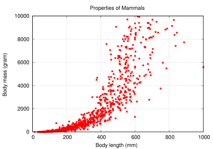
What does this show? Well, it shows that mammals with large bodies tend to be more massive. That's ... not really a surprise. The relationship is somewhat hard to describe mathematically, because it's a curve (as well as rather noisy).
  Q:  Is there anything we can do to figure out a simple mathematical
           relationship?
Sure! One thing we can do is to try plotting these measurements on a log-log scale (or, equivalently, plot the logarithm of each measurement on linear scale). For example, plotting mass versus length on a log scale yields this:
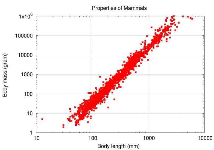
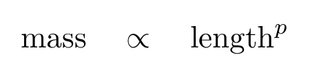
Whoa! That's a pretty tight relationship. When one sees a linear relationship on a log-log graph, it means that there is a power law connecting the two variables:
What's the value of the exponent p in that equation? It's the slope of the line in this graph ...
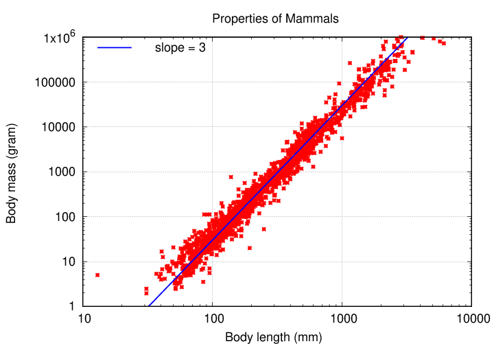
... which turns out to be 3.
We can see the same relationship (though it's harder to see clearly) if we modify the measurements themselves. For example, suppose that instead of plotting "body length" on the horizontal axis, we plot "body length cubed".
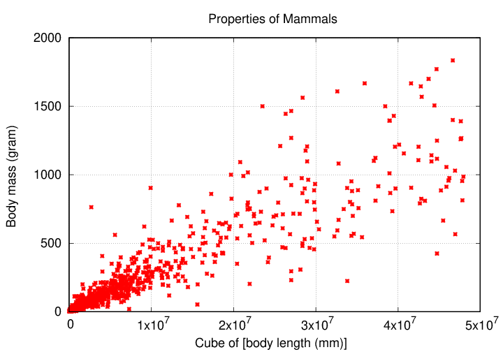
  Q:  What does it mean that the mass of an animal increases
              with the third power of its length?
Copyright © Michael Richmond.
This work is licensed under a Creative Commons License.